Chocolate Packaging Design Inspiration
Packaging design has a huge impact on a product’s success. There are many things that need to be considered when designing a package – it is design that has to function. It has to protect what’s inside and allow for easy storage and distribution. It also needs to display information about the product and draw attention to itself on a shelf full of competing products. According to Marty Neumeier in his book The Brand Gap, “A retail package is the last and best chance to make a sale.” Here is an article that outlines some statistics on why packaging is so important.
We are currently working on a project to rebrand a chocolate company (stayed tuned for more details on this) and have been doing research on packaging and design ideas.
Below are a few of our favourite designs we have come across:
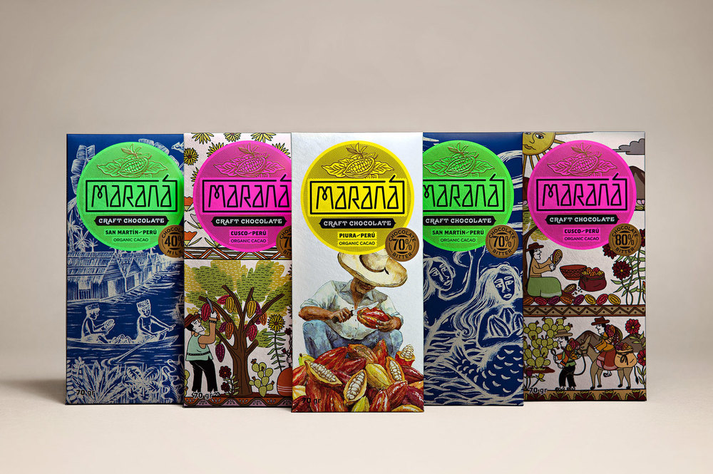
Maraná Craft Chocolate
When I first saw these chocolate bars in a grocery store in Peru I was immediately drawn to the packaging. Maraná Craft Chocolate is made with cocoa supplied from three different areas of Peru, ICONO developed the Maraná brand and its packaging. ICONO designed illustrations to reflect the popular art of each area of Peru. The illustrations highlight the traditions and culture of each place giving each bar it’s own personality.
Ritual
For each bar the package design consists of border design, delicate illustrations. Each design speaks to the subtle differences that each coffee bean creates in the chocolate bars. The outer packaging opens in a unique way, making it a memorable experience as you unpackaged the chocolate and learn about the story behind Ritual’s origin and process.
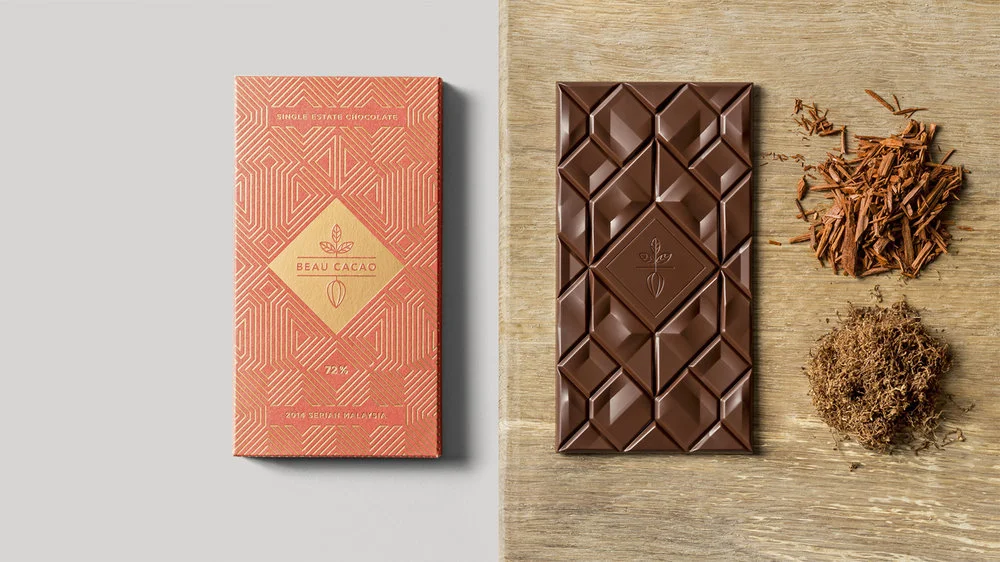
Beau Cacao
Crafting from Malaysian cacao, they make fine chocolate bars that truly reflect the regional character and terroir of their origin.
Socio Design did the packaging for these bars, using fabric designs from the origin country as inspiration.
MITA
Mita is an artisanal bean to bar chocolate business grinding and moulding on a single site in Bogata, and sourcing its beans from across Venezuela, Peru, Ecuador and Colombia. Moniker is the design studio that created the visual identity and package design system.
A variety of bright flat spot colours, are contrasted with the visual texture of fine monolinear lines. The patterns are appear to be a subtle reference to traditional South American cultural artefacts such as woven rugs. The system of patterns give each bar a distinct look but the components still create a system that is impactful. When viewed together the design gives the brand identity a consistent and recognisable visual style that easily scales as new products are introduced.
Lyra
The design is simple yet playful contrasting brown with splashes of color. The kraft paper, accentuates the chocolates handmade production and honest approach. Pictograms on the front side makes the packaging look like postcards.


