Our top tips for creating a visual brand identity your customers won’t be able to forget
Now more than ever, businesses are expected to be present across all platforms, making themselves available to potential customers in all the major corners of the world wide web.
But establishing a visual brand identity that is consistent, compelling, and memorable isn’t as simple as one might think. When it comes to social media branding, your followers expect clarity, cohesion, and stimulation - a delicate mixture that many businesses struggle to execute.
Thankfully, there are many resources available to business owners who are looking to improve their branding on social media. Developments in technology, the accessibility of graphic design tools, and the rise of digital marketing have all contributed to a new age of business promotion, where the importance of visual branding is apparent and valued.
After all, consistent presentation of a brand increases revenue by 23 percent on average - an increase that any business would be thrilled to benefit from.
Additionally, 60% percent of US millennials expect consistent experiences when dealing with brands online, in-store, or by phone.
So, what can business owners do to enhance their social media branding and increase customer loyalty?
Let’s get to it.
HERE ARE 5 WAYS YOU CAN IMPROVE YOUR BRANDING ON SOCIAL MEDIA AND EXPAND YOUR CUSTOMER BASE:
1. START WITH A DYNAMITE LOGO DESIGN
Your logo is one of the first and most important aspects of your brand that potential customers will notice.
In fact, it only takes consumers 10 seconds to form a first impression of a brand’s logo.
Are you capitalizing on those initial moments?
When deciding on a logo for your business, it’s important to keep three fundamental design rules in mind:
Keep it simple. Logos should be easy to identify with as little clutter as possible. Avoid complicated designs or text that will be difficult to read if the logo is down-sized. You want customers to be able to recognize your logo no matter where it appears.
Never sacrifice symmetry. Did you know that the human mind naturally equates symmetry with beauty and pleasantness? It’s true. In order to make your logo more appealing to potential customers, focusing on a symmetrical and well-balanced design is recommended.
Focus on flexibility. Your logo is going to appear on all of your branded materials and social media profiles, so it’s crucial to choose a versatile design. Be wary of textures and details that could be compromised depending on where your logo is displayed, and consult with an experienced design agency.
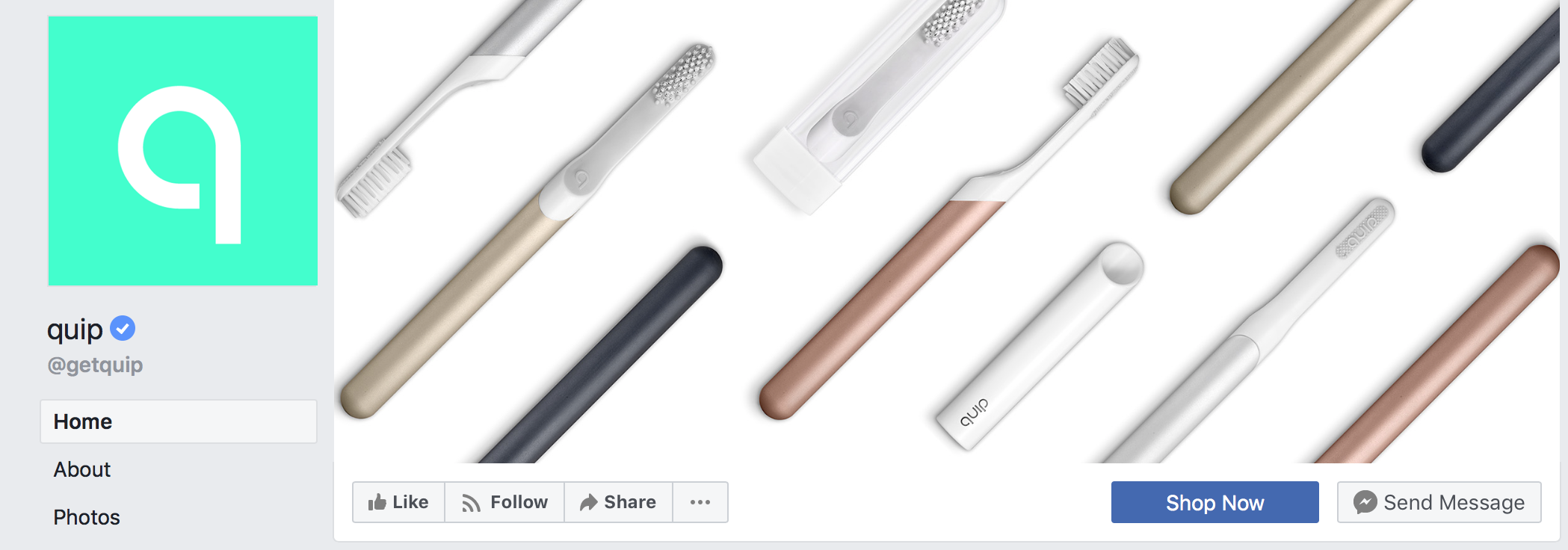
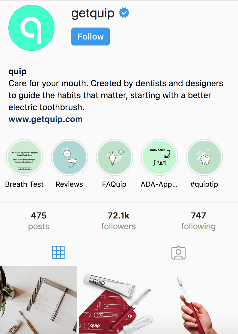
See the examples below from Quip, a company that sells oral health products, for a better idea of simple, symmetric and flexible logo design.
https://www.facebook.com/getquip
https://www.instagram.com/getquip/
https://twitter.com/getquip
2. PICK YOUR COLOR PALETTE CAREFULLY
The colors that your company uses have a massive impact on the efficacy of your visual brand identity.
In fact, research suggests color can boost brand recognition by as much as 80 percent.
Statistics like these emphasize the importance of visual branding, so when deciding on a color palette for your business, be sure to consider the following:
Blue is the preferred color of men. 57 percent of men say blue is their favorite color. Blue also represents security, tranquility, and intelligence.
Orange is the least preferred color for women. A whopping 33 percent of women say orange is the least appealing color.
Green is a safe second choice. After blue, green is the second-most preferred color among adults aged 19-50.
For more information about the psychology of color in branding, check out this informative infographic from HubSpot.
3. TAKE A UNIFIED APPROACH TO GRAPHICS AND IMAGERY STYLE
There is no magic formula for how to build a brand online, but there are some general rules that have stood the test of time, and one of those rules is consistency.
In fact, 41 percent of consumers rate the brand’s consistency as the most important factor when it comes to being loyal to a brand.
But one of the common mistakes business owners make is thinking that consistency need only apply to their logo. This couldn’t be further from the truth. The colors, images, and graphic content you use and share should also be consistent and streamlined.
The online cloud-based storage company, DropBox, does a great job of keeping their imagery style consistent in their social media branding. Note how they used the same color, graphic, and logo below, both in their profile picture and in their tweet.
For more imagery style inspiration, check out the branded graphics we created for Whitespark.
4. STEP OUTSIDE THE TYPOGRAPHY BOX
Many business owners tend to rely on popular fonts, opting for the most familiar choice to keep things simple. But taking a risk and stepping outside your comfort zone can pay off, when done correctly.
As long as the font you choose is highly legible across digital devices and comes with variations (italic, bold, etc.), it’s okay to get a little creative with your selection.
Netflix is a perfect example of creative font use. They actually have their own custom font, which is recognized around the world.
https://www.theverge.com/2018/3/21/17147170/netflix-sans-custom-font-typeface
The Netflix font is clean and animated, making it legible and easy to identify.
Remember, 95 percent of information on the web is in the form of written language, so using typography to distinguish your brand from competitors is always an integral part of any social media branding strategy.
5. BUILD A BRANDED TEMPLATE LIBRARY
Our final tip on how to build a brand online is all about preparation. While you work on solidifying your visual brand identity, you are going to need new images and graphics on an ongoing basis.
Designing a social media graphic or blog post cover from scratch every time you need one can be time consuming, taking you away from other important tasks that need to be completed.
So, why not build an online template library, so you can simply edit graphics as you need them?
Free online graphic design tools like Canva and Design Wizard allow users to create their template libraries at absolutely no cost - a great option for startup businesses or nonprofits.
And there you have it - the five most important steps to creating a consistent, memorable visual brand identity across your social media platforms!
ABOUT AVENIR CREATIVE
We pride ourselves on being one of the most trusted and dedicated design studios in Edmonton. We take a meaningful, strategic, and creative approach to our projects, and use our skills to better communicate your business objectives, what you stand for, and why you exist.
ARE YOU INTERESTED IN STRENGTHENING YOUR SOCIAL MEDIA PRESENCE WITH A GRAPHIC DESIGN AGENCY YOU CAN RELY ON? CONTACT US TODAY. WE’RE ALWAYS READY TO WORK SOME MAGIC.


