Winter Product Packaging Design
Being from Thailand, winter was never part of my childhood growing up, but after twelve and half years in Canada, winter has grown on me. With all the winter festivals that have been happening around Edmonton such as Winter Shake-Up! Festival & Market, Flying Canoe Adventure Walk, Ice on Whyte, and Silver Skate Festival it makes you realize that if you learn to embrace the season, winter can be extremely beautiful.
By embracing the beauty of each season, brands can use this opportunity to connect with their consumers in a more engaging way through seasonal packaging. Seasonal packaging provides brands with an opportunity to increase sales and build brand equity by incorporating seasonal changes into their brand story.
For this month’s blog I decided to feature examples of great winter season packaging design:
1. Hopper Whitman Winter Brew
The Hopper Whitman Winter Brew is a winter ale that combines a complex hop aroma, rich malt flavor and a blend of balanced toasted spice. The design of the packaging features Hopper Whitman, a beer-swilling hopping cricket whose outfit changes with the seasonal ales. The packaging design for the winter brew, designed by New York's Stranger & Stranger features Hopper Whitman with boots and a scarf in a snow covered landscape.
2. Jones Soda Co.'s Holiday Bottle and Winter Jumble
The limited edition packaging for Jones Soda Co.’s Holiday Bottle and Winter Jumble designed by Super Big Creative features vibrant whimsical illustration of winter scenes.
3. Mikkeller Wild Winter Ale
Designed by Bedow. “A collaboration with Danish brewery Mikkeller. This Wild Winter Ale is the fourth in a series of four seasonal beers released during 2012. The label is printed with a heat sensitive color — when the label gets warm the apple tree loses its leaves. Limited to 3,500 bottles.” - Bedow
4. Widmer Brothers Brewing's 30 Beers for 30 Years Series
The 30 Beers for 30 Years Series is a unique celebration of Widmer Brothers Brewing’s 30th Anniversary. From April 2014 to April 2015 they will brew and release 30 small batch beers, each brewed to commemorate a specific year and beer in the brewery's 30-year history. For the label designs they will be using thirty different local artists from Portland to design labels in this series based on their interpretations of the beer. Below are label designs from two local artists.
1997 Winternacht Double Alt designed by Jen Wick
“My design inspiration for typography comes from a lot of old type specimen books—I wanted to reference German Fractur and Calligraphic typography. The bottle design was specifically inspired by the conversation I had with Kurt Widmer about having a Northwest Apres Ski experience—the feeling invoked from enjoying a strong, warm winter beer at the chalet after a day on the mountain.” – Jen Wick
1999 Snow Plow designed by Alex and Vanessa DeSpain
"Our design is inspired by the story of Snow Plow and the history of Milk Stout beer. The word-mark is inspired by Victorian typography and the symmetrical snowflake contains elements of the Widmer Brothers fermentation building, beer bottles, a bottle opener, and bottle cap. We created a design that is a reflection of the delicious taste of Snow Plow."
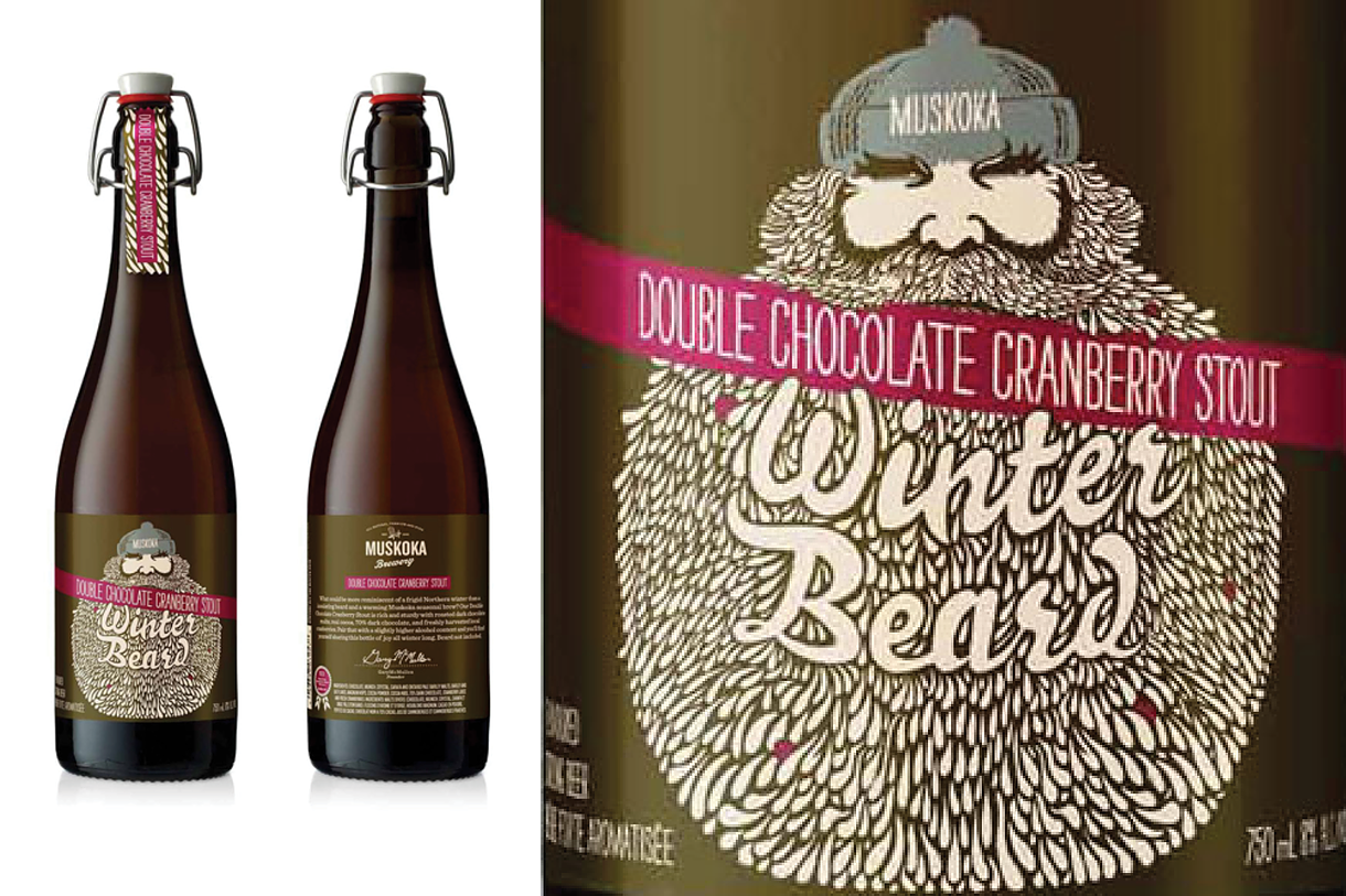
5. Muskoka Winter Beard
Designed by RETHINK. “What could be more reminiscent of a cold Northern winter than an insulating beard and a warming Muskoka seasonal brew? Our Double Chocolate Cranberry Stout is rich and sturdy with roasted dark chocolate malts, real cocoa, 70% dark chocolate, and freshly harvested local cranberries. Pair that with a slightly higher alcohol content and you’ll find yourself sharing this savoury offering all winter long. Beard not included.”
6. Leckerlee Lebkuchen Tin
Designed by Strohl. "Reminiscent of gingerbreak, Lebkuchen are traditional German cookies which have been sold in elaborate decorative tins for hundreds of years. Our client's almost unhealthy obsession with Lebkuchen led her from Berlin to New York City in a quest to creat her own modern interpretation.
Leckerlee needed a brand identity & packaging deeply rooted in the history of these spicy, oversized cookies (typically sold in Germany and other parts of Europe during the holidays). We used traditional lebkuchen tins and other antique German confection examples as a groundwork for the logo, iconography and patterns. A bear is a sentimental animal in German culture, creating visions of small town Christmas and warming foods. An upright script logo, paired with traditional grotesque typography and holiday motif patterns complete this distinctly German identity.” - Strohl
7. La Face Cachée de la Pomme's Niege
The cidery La Face Cachée de la Pomme approached Chez Valois to redesign the brand identity and packaging of the product line.......a clean and minimalist design was created based around a pattern of snowflakes that can be found throughout the product line. A lot of subtle elements were also included in the design of the packaging, such as a peel-off label on the back of the bottle that allows to include more information on the history of the cidery and on the fabrication process of ice cider. Custom packing tape was also created to help identify which of the three versions of the product can be found in the shipping boxes.


