
How to Effectively Communicate Your Data
Being able to effectively communication data is important when one is trying to persuade decisions or influence actions. Whether you want to explain data using chart and graphs, or convey a story through an infographic, we’ve put together tips on how to effectively communicate your information.
Organize Your Data
Have a clear idea of the data you want to visualise
Clean up your data and remove any information that is not relevant

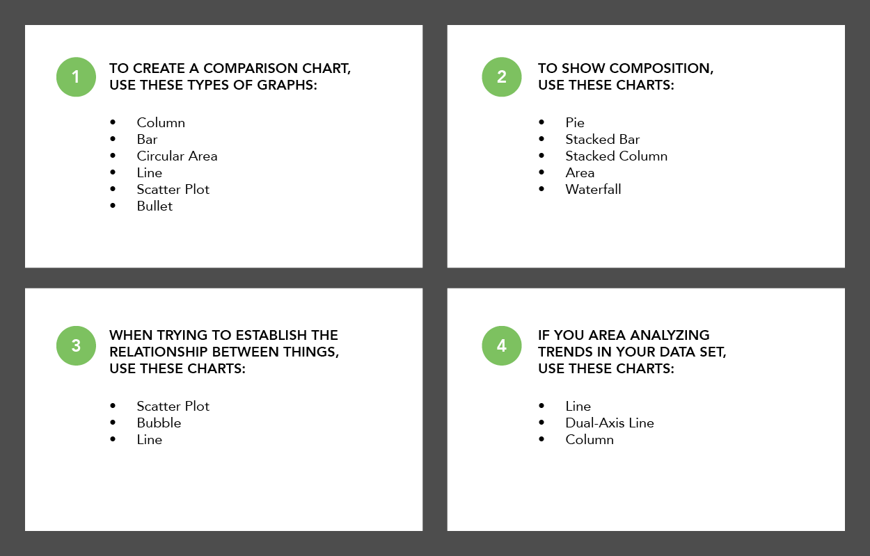
Choose the Right Chart or Graph for Your Data
Ensure the graph/chart you select clarifies your data, picking the wrong type could confuse the viewer or lead to data misinterpretation
Simplify and Remove Clutter to Reduce Distraction
- Keep the design minimal so the viewer can focus on the data
- Remove backgrounds, redundant labels, or special effects
- Lighten or reduce grid lines

Balanced and Cohesive Visuals
- Try to limit your colour palette to two or three colours, and use tints and shades when more colours are needed
- When applicable use colours from your corporate identity
- Use no more than two to three typefaces

Make Things Legible
- Don't obscure your data
- When applicable, use a transparency in your graph so the viewer can see all the data
- Use legible font size and weights, for data values and axis labels

Make Sure You’re Not Misrepresenting Data
- The human visual system naturally experiences a disk’s size in terms of its area. Thus bubbles should be scaled according to area, not diameter
- Adjusting the diameter of circles to match the data instead of the area, incorrectly sizes the circles dramatically

Use Legends Carefully
Do not duplicate information in the legend if the information is already available from your graph

Visual Hierarchy and Composition
- In your overall layout, use colour, typography styles, and size to create visual hierarchy
- Visual hierarchy guides viewers through the information in a specific order
- Viewers tend to move across content in a 'Z' pattern. Put the primary content at the top left corner of you layout, and put content you want people to terminate with at the bottom right corner
