
Pinocchio Ice Cream
visual identity | Packaging design
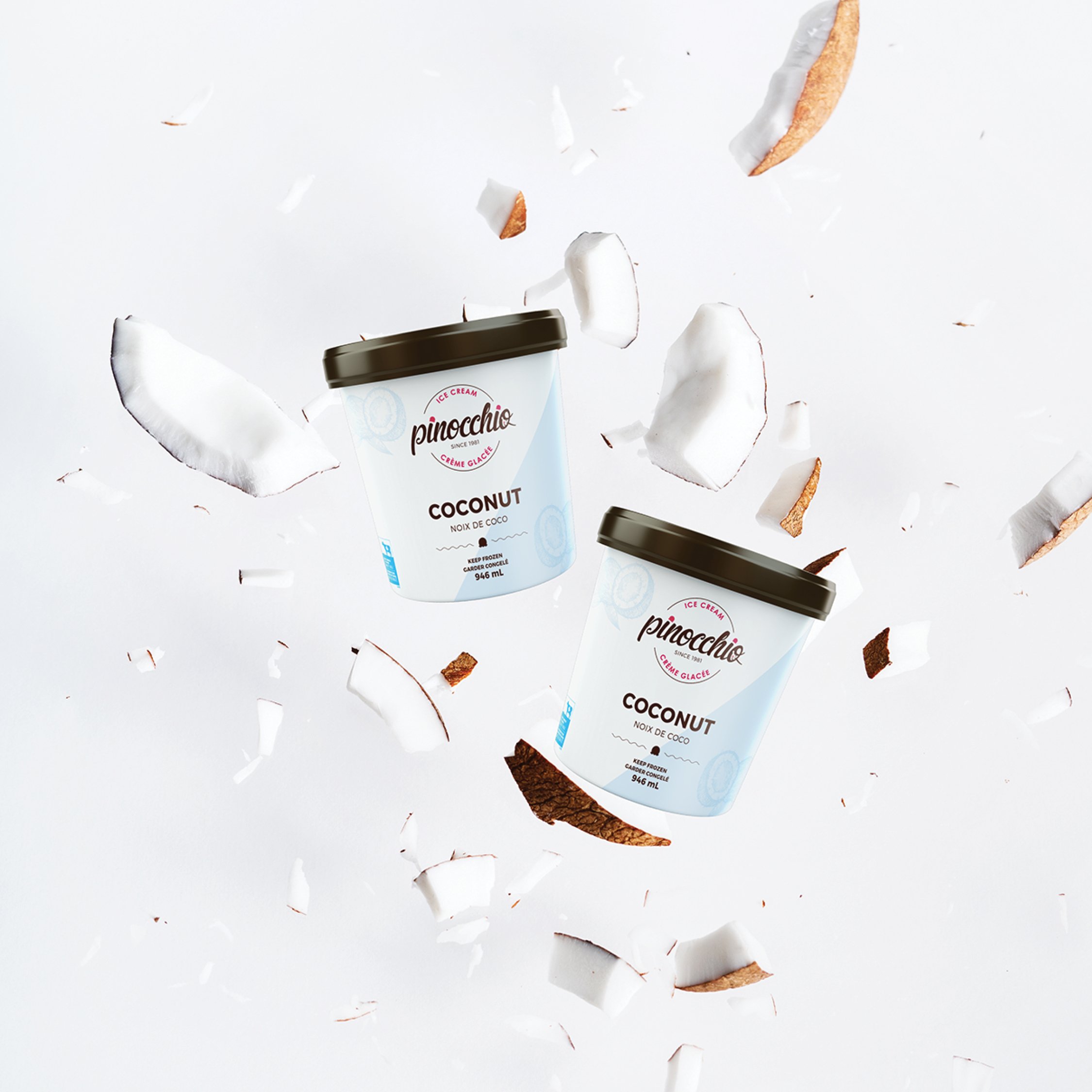
Details
Pinocchio Ice Cream, a dedicated craft ice cream artisan based in Edmonton, Alberta, began its journey in the early 1980s. Their vision was simple yet profound: to introduce Alberta to the delights of top-notch European-style ice cream, crafted using the finest local Canadian ingredients whenever possible. During that time, Edmonton lacked small, local ice cream producers.
As the years rolled on, Pinocchio Ice Cream experienced growth, with the demand for their exceptional product soaring. They now proudly supply their creations to a wide range of local restaurants, grocers, cafes, and special events in the town.
Recognizing their growth and the need to reflect the evolution of their company, they decided it was time to revamp their packaging. This update aimed to mirror the company's commitment to producing honest, premium, and natural ice cream products. Through these redesigned labels, they sought to showcase the quality and authenticity that has become synonymous with their brand.

